Schleich rebranding
Schleich, the global toy company, came to us to help reposition their brand with a focus on sparking limitless storytelling in kids.
That was the main goal, but their old logo also needed a refresh, both to modernize it and to align it with the new brand positioning.
We heard it (the logo asking for a refresh), I proposed a new one and they loved it.
From there, we developed new art direction guidelines covering logo use, product and lifestyle photography, packaging and more, all in line with their new tagline: Where Stories Begin.
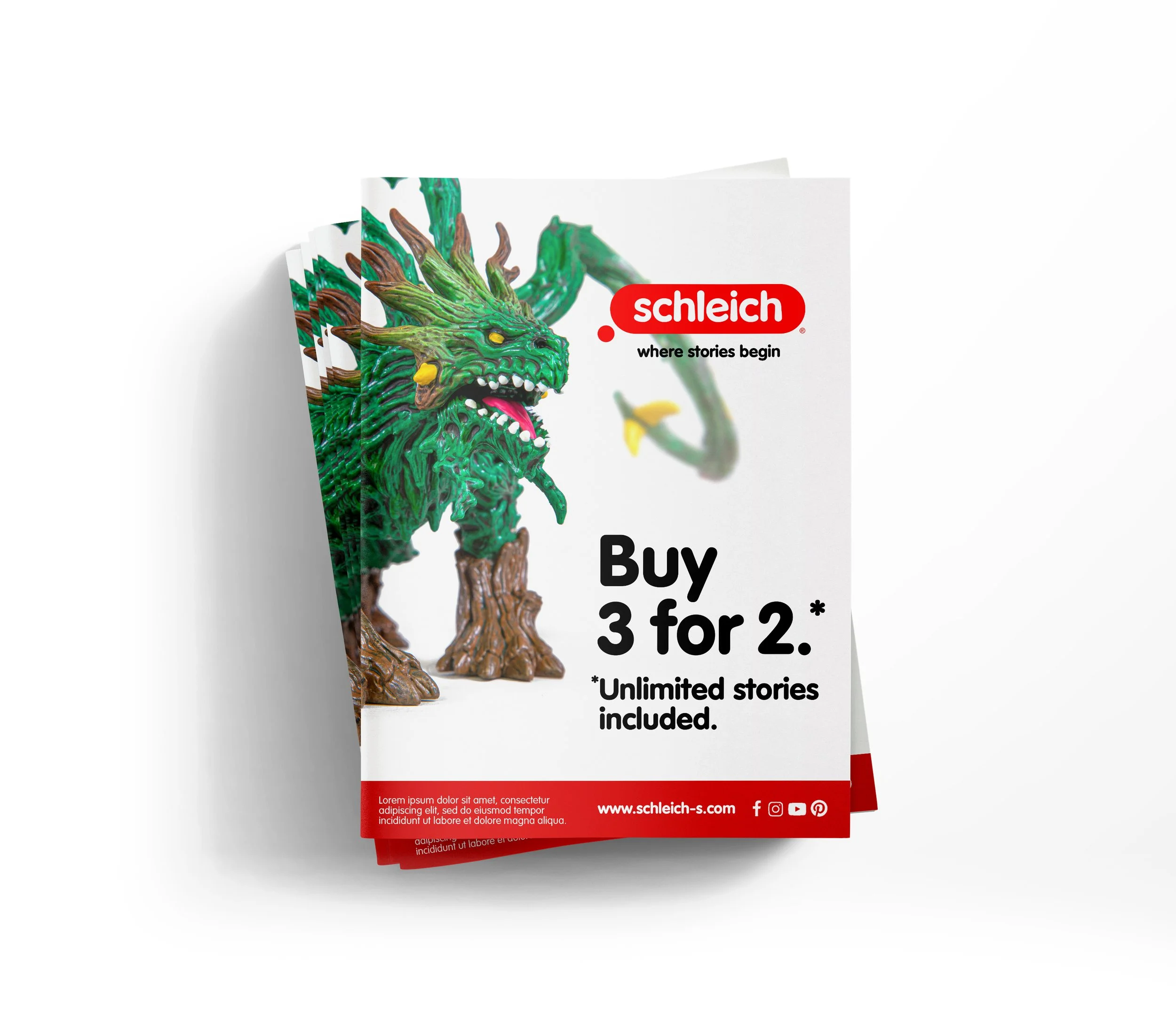
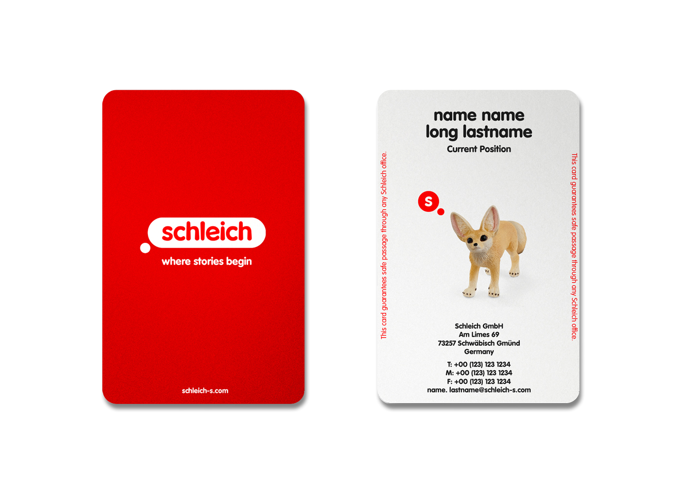
Logo Redesign & Brand Identity
I evolved the Schleich logo, retaining their iconic red, customizing a font to make it more playful and child friendly. Along with new typography guidelines, we simplified the design for easier application across global markets.
Side note. It’s worth noting that this project took place during the pandemic, so we developed it with very limited resources.
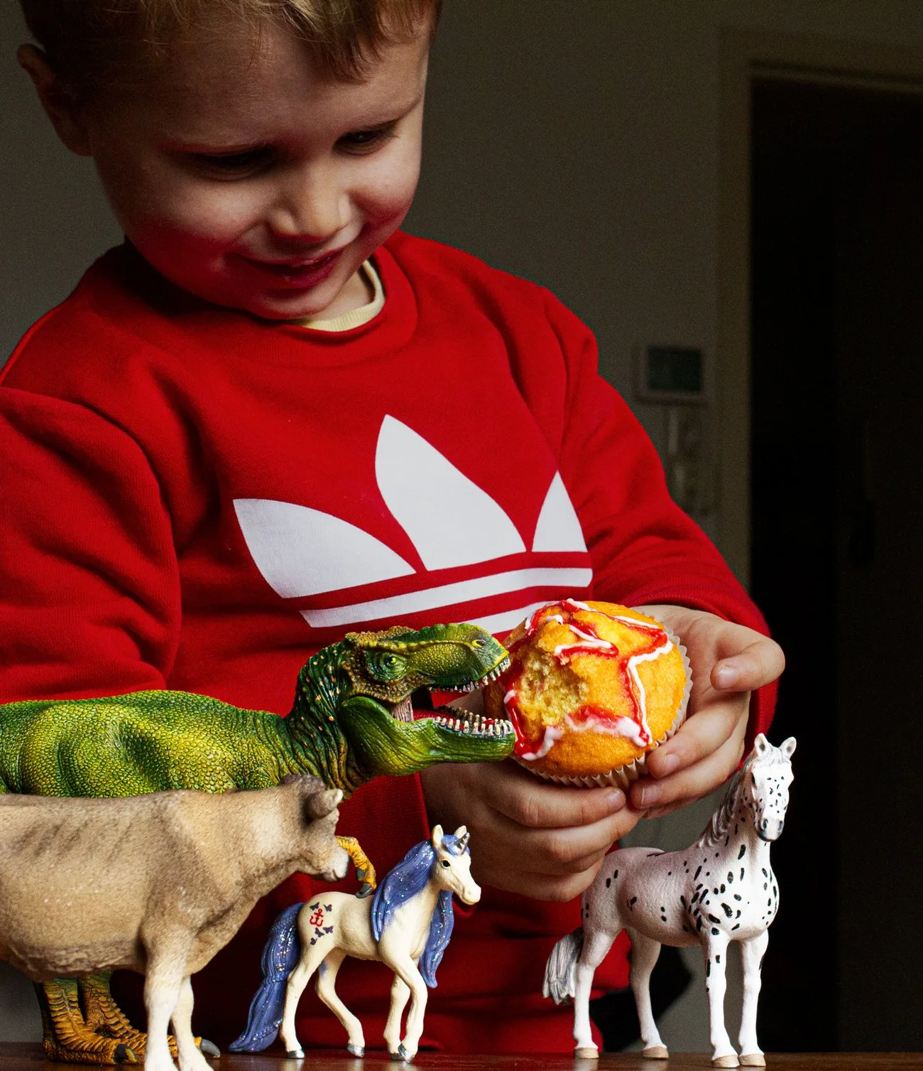
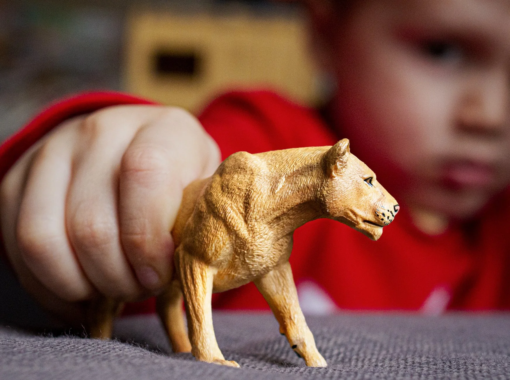
While I provided the creative direction, the images below are concepts built with images I shot at home with my son that helped them understand and sell the concept.


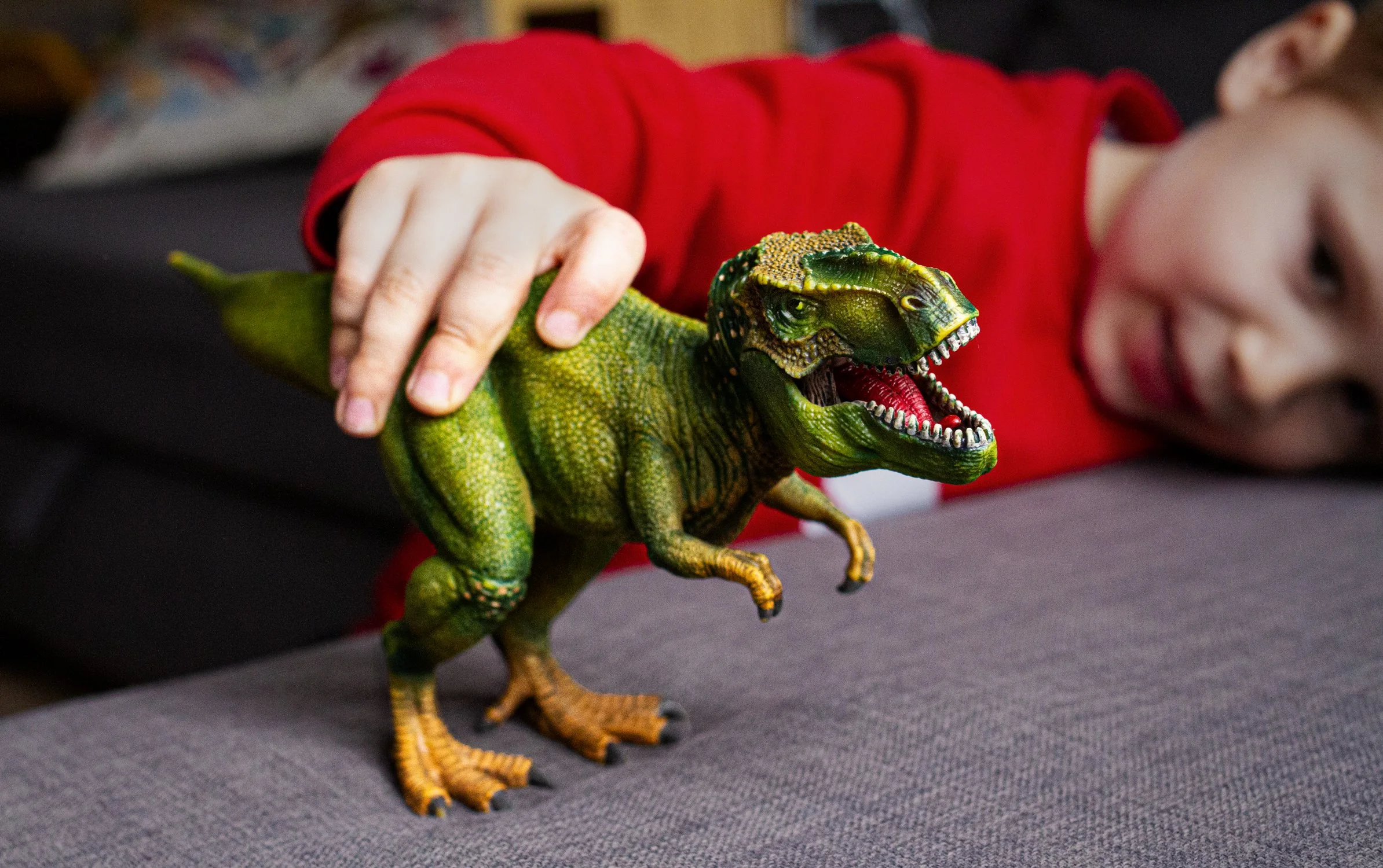
Art Direction for Photography
I created new photography guidelines to reflect the new tagline and highlight the toys’ premium quality. By lowering the camera to the toys’ level, like seeing through a child’s eyes, and using close ups in everyday scenes, I brought the figurines to life as real characters in a child’s world. Each image includes a touch of storytelling, keeping the animals as the main focus and the kids as secondary characters.
As mentioned, this was a COVID project with very limited resources, so I shot these photos below myself to help define and explain the brand photography guidelines we established.


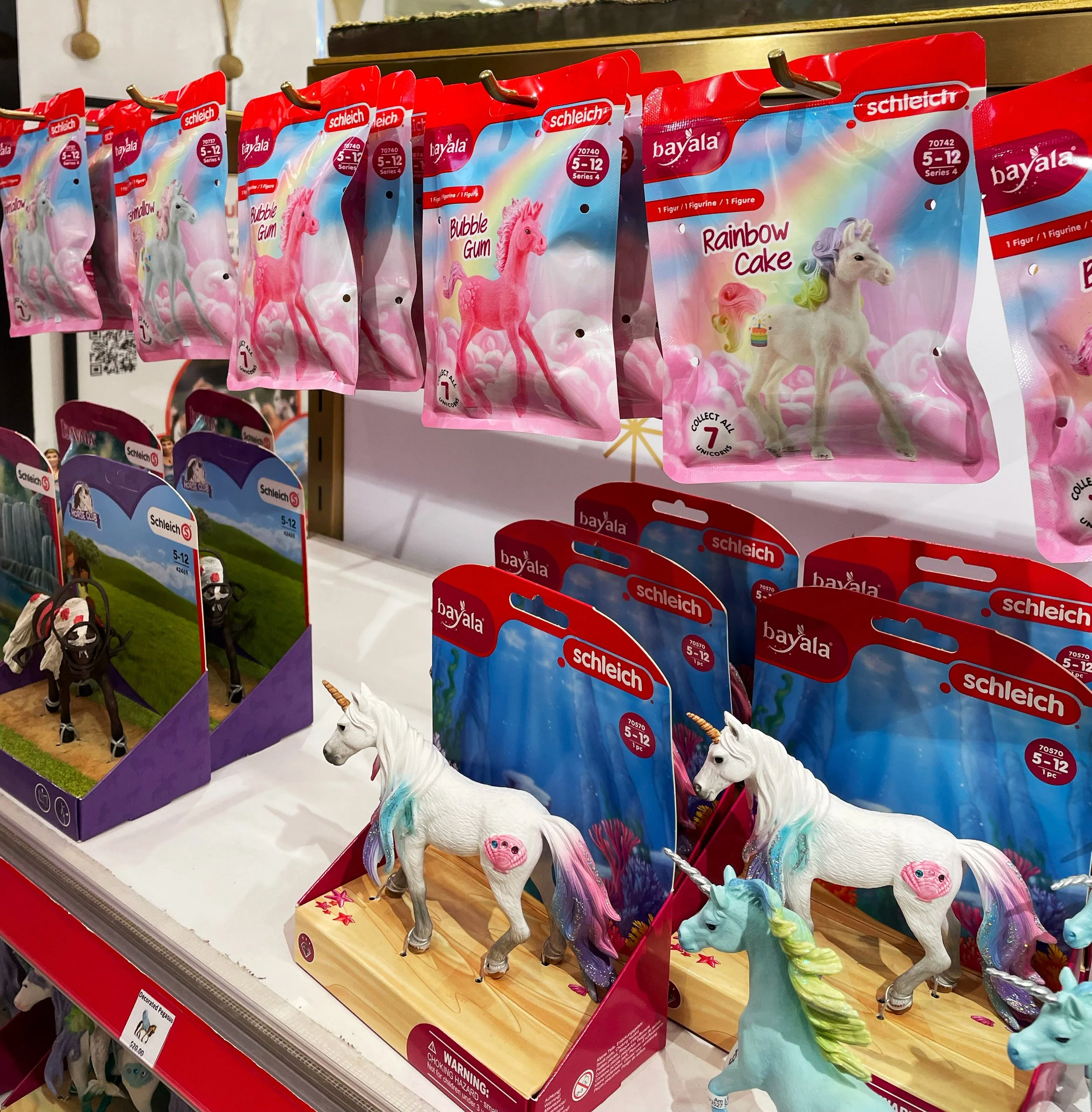
Then it all became real.
Over the last two years they’ve started introducing the new brand into the world.